Your photos are beautiful (of course!) You’ve edited them to fit in the blog post (perhaps using Picmonkey – we love it!) and they’re exactly what you want to show off the new blusher you’re blogging about. You upload them to your space on Blogger…but something looks different? That’s not the same image you uploaded!
Did you know that Google took over Picnik, the predecessor to Picmonkey? Because of this, whenever you upload a photo to your Google space, they will use an auto enhance filter which will smooth things out, correct the lighting, etc. But you don’t want that!
To turn this feature off, head to your Blogger dashboard, and click your icon in the top right corner, then the big blue “View Profile” button. You’ll be taken over to your Google+ profile.
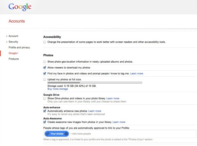
Hover in the top left corner (on the G+ logo) and a menu will pop up – click the settings icon. Scroll down, down, down (it’s a huge settings page!) to the Photos heading.

Uncheck the box that says “Auto enhance: automatically enhance new photos” and your settings will be saved automatically (no need to click save anywhere)
That’s it! You can switch this on and off as you like


Blogger advice – How To Turn Off Blogger And Google+ Auto Enhance Images http://t.co/9kQXN9z4hl http://t.co/ktqcfbv3Vh
“@BonjourBlogger: Wondering why your #Blogger hosted photos don’t look right? Turn off the autoenhance feature! http://t.co/DW7miZM3Bc“
@zoegeorgina24 Just wondering if you’ve turned off auto enhance? http://t.co/Z8n26tZQkQ because i used to have the same problem!x
Thank you so so much for this article! I did not notice a change on my account until this Saturday, when every photo I uploaded to Blogger looked too orange and the contrast too strong, but my same photos looked just fine on Facebook. So glad I came across your article to turn that auto “enhance” off!
@BeckyBedbug http://t.co/mnJCyumeiV
140 characters isnt enough!! lol
How can I stop Blogger from dulling images that I’m using from the web. I have an ad on my sidebar that is done through html and links the image from another source. On my site it is dull, when opened in another tab it is bright.
Hi Andrea,
I couldn’t see what you meant on your site, but the main thing that I think it might be is if you have some CSS on your site that causes hyperlinked items to change colour (if you hover over the image, it might fade or change colour?)
Oh my god thank you! I could kiss you right now. I’ve been sitting here for hours trying to get rid of the grey cast in my photos and this was so simple to do.
Again, Thank You!
Thanks so much!! I couldn’t figure it out! Now it’s ten times better without the pinkish/orange hue :)