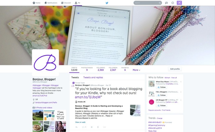
If you only use apps to access Twitter, then the new look may have passed you by. We round up the five biggest changes and what you can change to make sure your profile is looking as beautiful as it should.
New layouts
Probably the biggest change is how the new profile pages have changed to look like above, from the previous two column layout. A lot of people resisted the change, but it’s actually quite useful when you get used to it. You no longer need to have a background image on your layout, but you can still change the colours, etc on your layout to make sure it’s still personal to you.
Pinned tweet
The pinned tweet is actually kinda useful for the web version. Twitter is probably the first social media profile that people will click through to from your website, so it’s nice to have something at the top of your timeline that helps to explain what people can expect from your tweets, or if you have a specific thing you’d like to share with them – we’ve chosen to share the link to our Kindle book about blogging♦
New header image
Twitter have given you the ability to have a header image on your profile for a while, but now it’s bigger and much more prominent – more like the Facebook page header than the old Twitter profile. The image should be 1500px by 500px, and as the page gets bigger, so will the image, so it’s worth updating to make sure it’s still a good quality image. You’ll find this option in the profile part of the settings.
Font
Something that caused a surprising amount of discussion was when Twitter quietly (only really announcing it in a tweet from their @support account – do you follow that?) changed the font used on most of their website from Helvetica Neue to Gotham. The place where you’ll notice the difference in fonts is on the home page(your feed of all the tweets you’re following) as the timeline hasn’t yet been changed to Gotham.
Tweets in a timelines
If you’ve seen the new profiles, then you may have noticed that some tweets in your timeline will appear larger than others. If a tweet has received more “engagement” (retweets, favourites and replies), then it will appear slightly larger in your timeline to show that it’s more popular.
When browsing other peoples timelines, you’ll also be able to filter it so you don’t see all the replies to everyone else – a setting previously just for verified accounts, this is also a good way for people to decide whether you’re worth following
What do you like best about the new profiles? What do you dislike?


