So you’ve used our tips about using Twitter to your advantage, and you’ve checked out our post about gaining more Twitter followers, but is your profile looking a bit blah? Change it up!
There are some premade themes on Twitter, but the simplest changes will help tie your Twitter page into your blog – you may have heard how it’s a good idea to have a unified look across different websites, and Twitter is the first place to start.
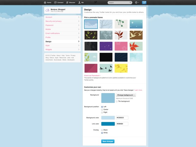
Here’s how your profile looks when you first join Twitter. Pretty bland, right? You could choose one of the 19 premade themes (side note: why 19? What a strange number!) or you could use colours that you have in your blog layout…
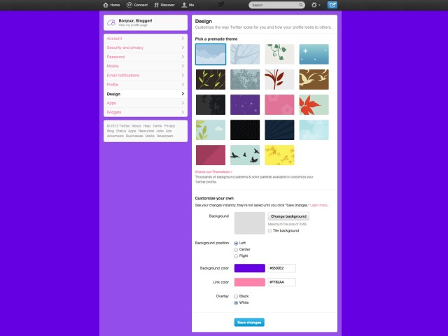
Like so!
This simple change was made by changing the background colour and link colours at the bottom of the page. You could also use a background image to provide more information about you – just make a graphic in Photoshop or Picmonkey and apply that to the background. Choose not to tile that image (it will look messy if you set an information image to repeat all over the page!) and test which way to align the image looks best (probably the left align position)
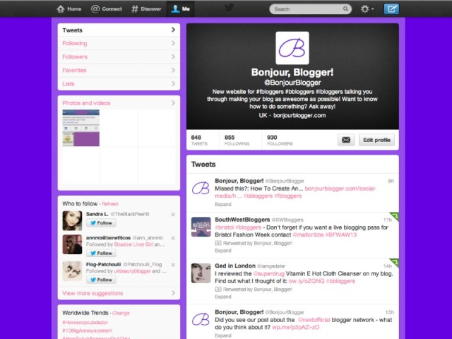
You could also upload your blog header image to your Twitter profile – see where the black space is on our profile above? You can change your header image from your profile page (as well as your profile image, bio, name, location and website – make sure those are all filled out like we discussed in our gaining more followers post) – just click the Edit Profile button and then the pencil icon over whichever bit you want to change.
Show us links to your pretty profiles in the comments!


