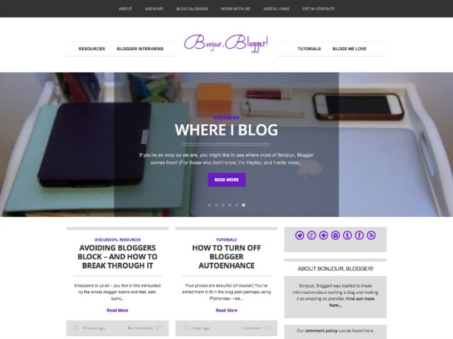
When Bonjour, Blogger! was launched back in May, it felt more important to get the site actually up and running than it was to have a layout that suited the content well. The first layout that was up was a slightly tweaked version of the Adelle layout by Bluchic which is a lovely layout, but we thought a traditional blog layout didn’t really work for the content on this site – it’s not the sort of thing you might want to read all at once.
We asked Faye what magic she could work, and…well, here you go! The main page has posts in blocks, so it’s a bit easier to pick and choose what you want to read. There are links to the various topics at the top of each page as well as useful links like the archive, contact page, etc. There’s even a random button to click when you feel like finding out something new!
A responsive layout was very important, since so many people have said they loved how the previous layout was so easy to read on their phones.
We’d definitely recommend Faye again – especially if you’re thinking of making the move from Blogger to WordPress (do it! You can do so much more with WordPress). We’d love to hear your thoughts on the new layout too – let us know what you love or what you think could be added!


Love, love, love the new look – it feels more like a news/information site and looks very slick.
The only thing I’d mention is some of the text based images in the slider thingy (yep, that’s how technical I am) look a bit pixilated. x