How annoying is it when you’re on your phone looking up something, and you go to a site only to have a huge “Sign up to our newsletter” popup take over the whole screen. Like, chill, I haven’t even looked at the site yet to know whether your newsletter is useful to me.. Or worse, when an ad loads and covers up everything you’ve gone to the site to look at.
Well, Google agrees. From January 10th 2017, if your site has a popup that means the content isn’t easily accessible from the search results, it may not rank as highly.
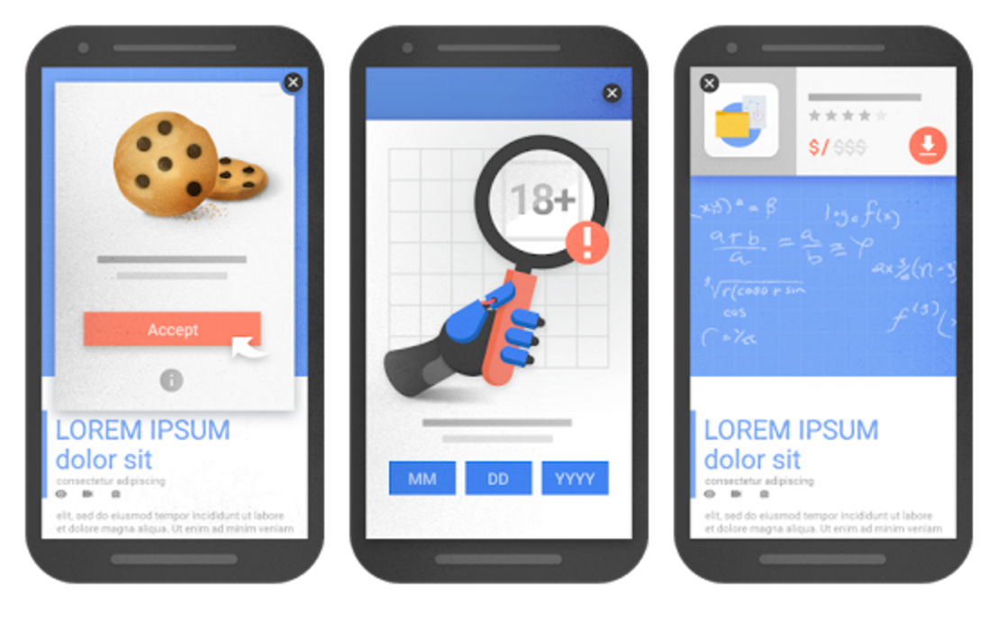
The good news is that this is fairly simple to change (you just need to adjust your settings on your ads and pop up plugins) Google provided three examples of what they’re looking out for
- A pop up that covers the main content, either as soon as the viewer comes to the site from the search results, or while they are looking at the content
- A pop up that the viewer needs to close or wait a few seconds before they can see the content
- A layout where the portion of the page that first appears (“above the fold”) is like a pop up that pushes the actual content down so the viewer has to scroll.
There are some types of pop ups that are fine though
- Pop ups needed for legal reasons – e.g. the cookie acceptance one that you’ve seen on every site, or things like age verification ones
- Login screens for content that isn’t normally viewable from a search engine – things like logging into your email, or news stories normally found behind a paywall.
- Banners that don’t take over the whole screen and are easy to dismiss.
There are various things that Google takes into account when working out where a site ranks in a certain search, so if a site scored highly with the other points, the negative points from the pop ups shouldn’t hurt too much, but if you want your site to not be affected, it’s a good idea to consider whether these sort of pop ups are needed on your site.


